
Baskin Robbins is an ice-cream brand which emphasizes on its array of flavors.
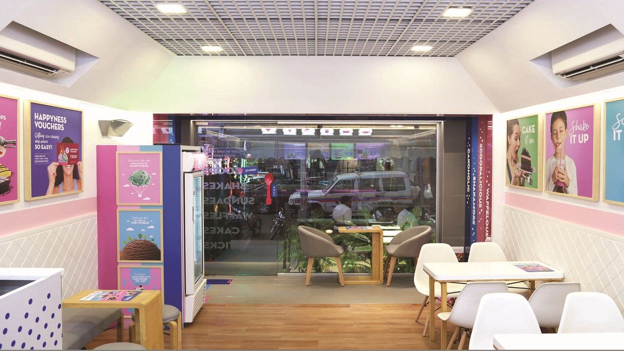
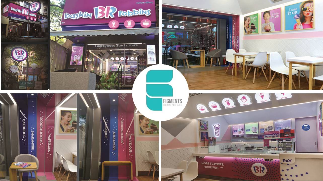
Reimagines the customer touchpoint by de-emphasizing ice-creams and highlighting togetherness with sweets. The design facilitates "Happiness" as a choice as well as a purpose. It comes from picking an offering comprising of different flavors or different offerings of the same palette.
Use of bright pops of brand colors contrasted with pastels from the same palette to ensure focus and recall. Elements like the mansard ceiling inducing a sense of shelter and texture, balancing the project-specific need of replicability. Seating configuration is designed to maintain the bandwidth of emotional connections, togetherness, and social networking. Reconfiguring hitherto unused spaces like threshold and giving the spatial positioning a young edge. Reorganizing the prep area to make it impeccable for staff and customers alike.
Visual communication that creates relatability and customer engagement through handwritten notes. Over and above the simple pleasure of a frozen, delectable treat, it creates an environment to celebrate success, settling arguments, buying for bets. What's not to love ..!
