
My Organics Earth is an artisanal brand growing, harvesting, processing and packaging their organic produce
The project brief started with articulating the value proposition that best describes the brand experience. The same was expressed by coining the name, developing the identity and related brand collaterals.
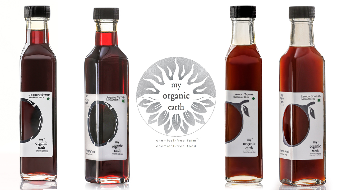
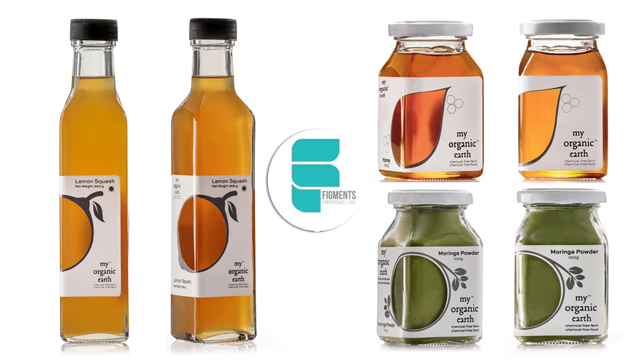
The logo is an amalgamation of forces of nature in play: the earth, the sun and water. The rigid geometry of a circle holds energetic fluid lines. One half depicts the sun and the sun-flower in the other half. Pure transition of the two forms is the essence of the logo. The form engulfs the name and the value proposition.
The essence was then extended to design of packaging in various denominations, for staples and processed products. This being an artisanal product, the offerings are produced in controlled numbers. Hence the labels had to be produced in-house, in a remote farm with limited resources.
Design of packaging find the footing in respecting the produce and its purity. Chemical free farm and chemical free food takes the centre-stage on the labels along with the a cut-out which frames the produce. Transparency emphasises the concept of “what you see is what your get”.
As the organisation reaches scale, the labels would be printed on handmade seed-paper. The paper made out by recycling waste paper will carry the seeds of the plants, from which the produce has been harvested.
