
01My Organic Earth
Experiencing Nature
Purity Produced From Farm To Table
Overview
Organic carries a strong and largely positive impression, but the word has become overextended. The expectation is authenticity, while the delivery is often limited to an aesthetic idea of what organic should look like.
The research began by exploring trust in organic.
Trust in food is built through signals such as sourcing, transparency, packaging, language and consistency. Since the consumer cannot see how something is grown, every design decision becomes part of that communication.
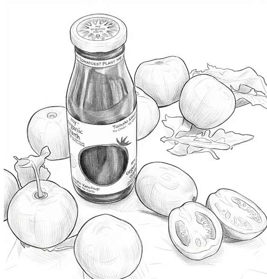
Sketch Development
My Organic Earth is a small-batch organic processed food brand that grows produce on certified organic farms and sources additionally from farmers who follow strict organic farming practices. The research translates this philosophy into a visual language across identity, packaging and interaction.
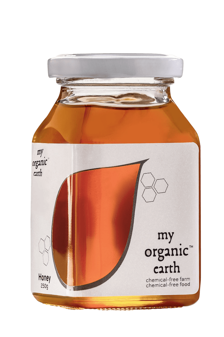
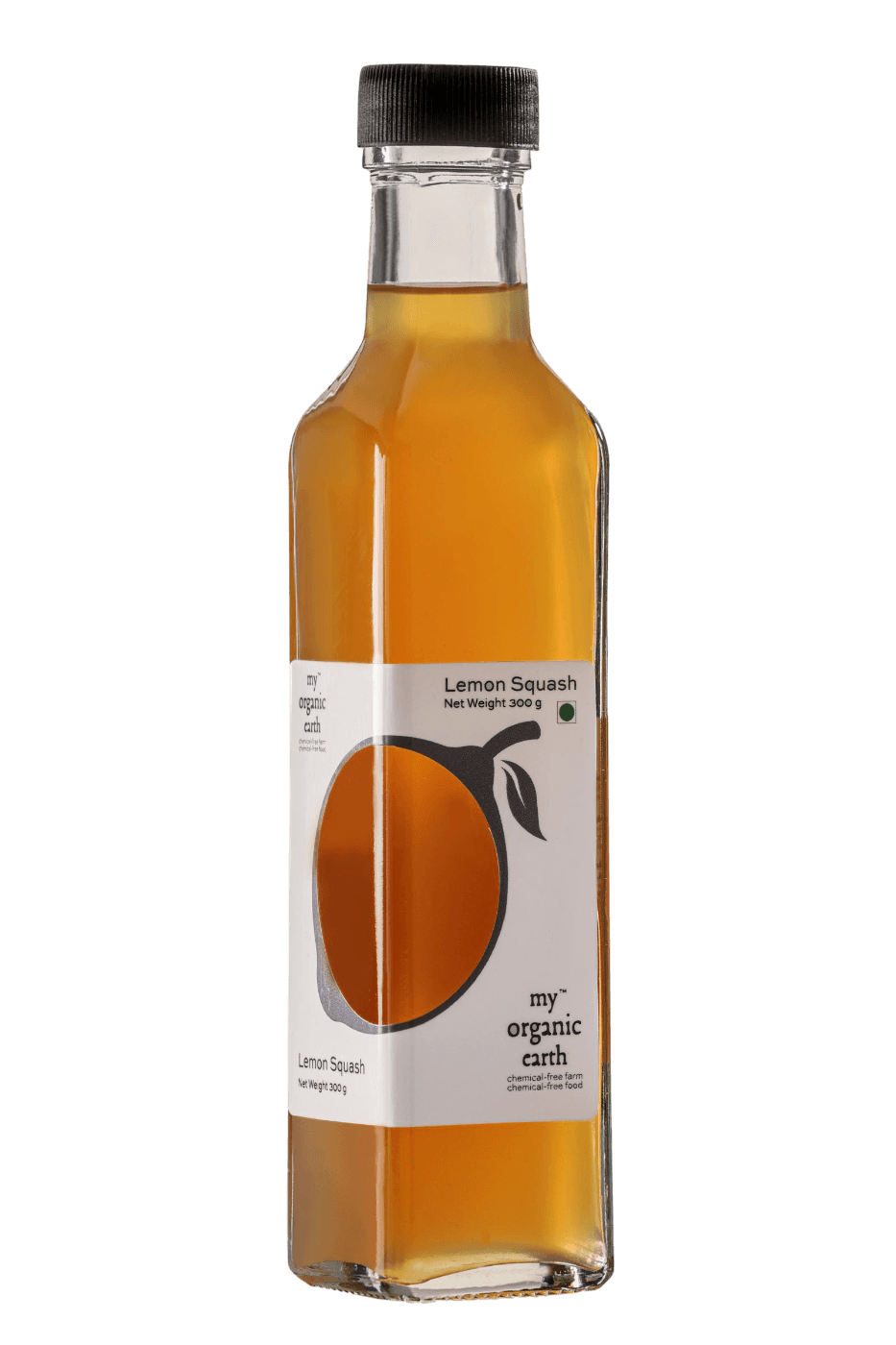
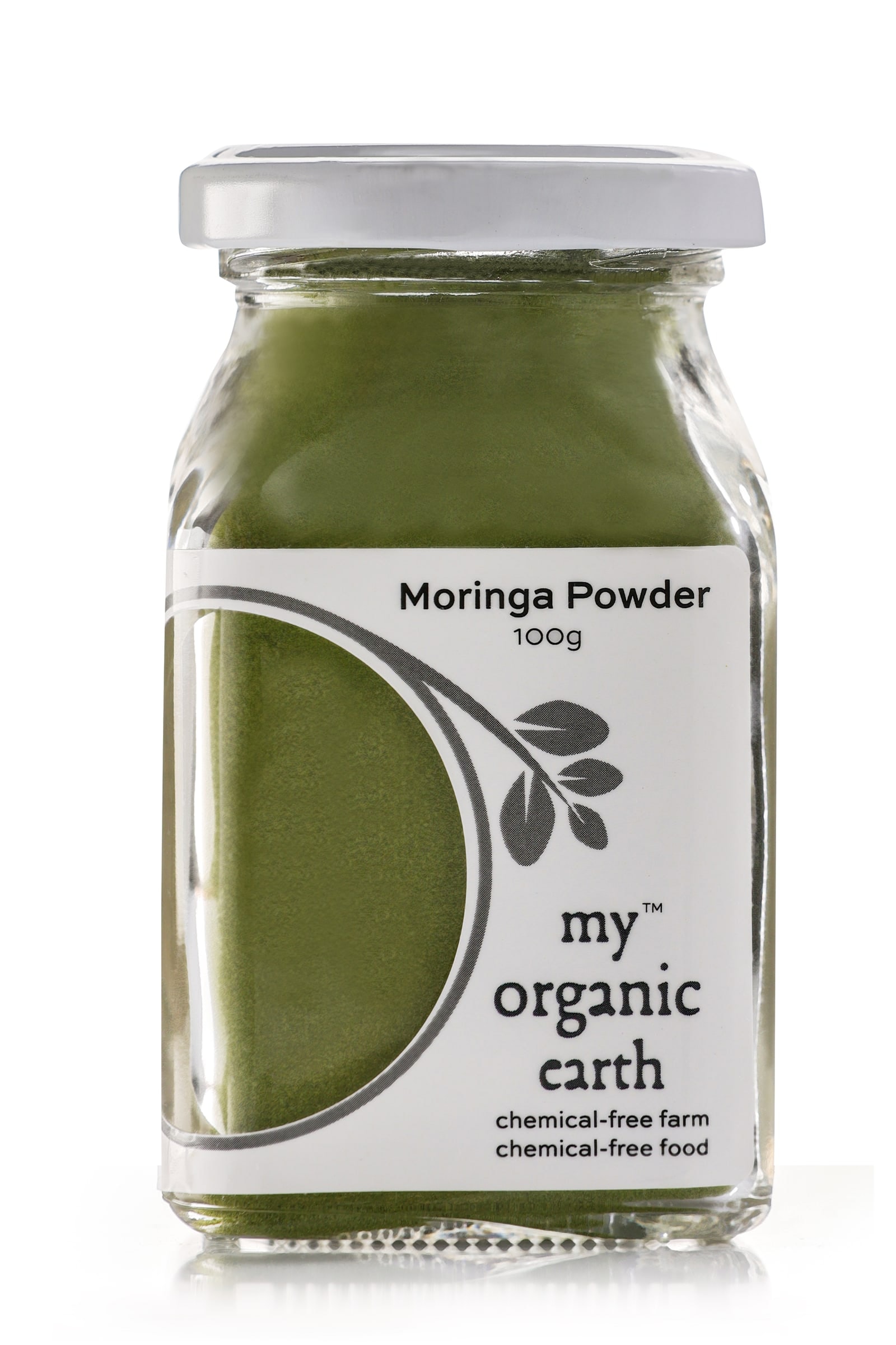
The identity uses My, Organic and Earth to establish a relationship between farmer, product, consumer and planet. Neutral tones, unfinished edges and imperfect typography treat imperfection as a virtue. The packaging uses a prominent circular cutout to signify purity while allowing the actual produce to complete the label. Colour is never corrected. Ingredients, nutritional information and product benefits remain accessible without overwhelming the consumer.
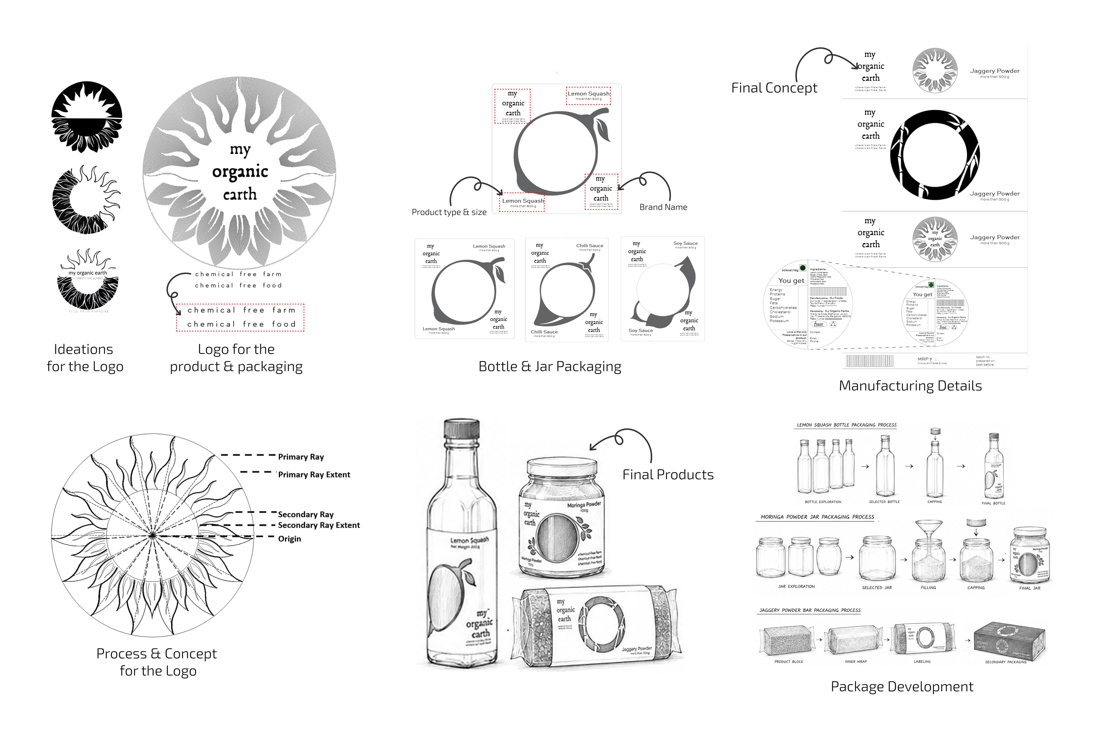
Final Outcome
The research extends beyond the point of purchase through a seed-paper neck label reading, “Want tomatoes? Plant me.” The package becomes an invitation back to the source.
The final system brings identity, packaging, transparency and interaction together into one consistent experience.
Rather than using design to perform naturalness, it allows the product and its source to remain visible.
Nature is not interpreted here. It is simply allowed to remain.
02CEAT - Tyre Sidewall Design
Experiencing Tactility
Semantics for the Road
Overview
The sidewall is one of the most visible surfaces of a tyre, yet for decades it has been treated largely as a surface for information. It identifies the tyre, communicates regulatory data and carries the brand, but rarely expresses what the product does.
The research began with this overlooked surface.

Mapping the surface
CEAT’s sub-brands occupy different positions within the tyre’s “magic triangle” of wet grip, rolling resistance and noise. SecuraDrive, CrossDrive and EcoDrive each respond to these parameters differently. The question was how these distinctions could be communicated before the tyre ever meets the road.
The first step was to map the existing sidewall. Regulatory information was standardised across the portfolio, creating a consistent framework for brand identity, product differentiation and performance communication.
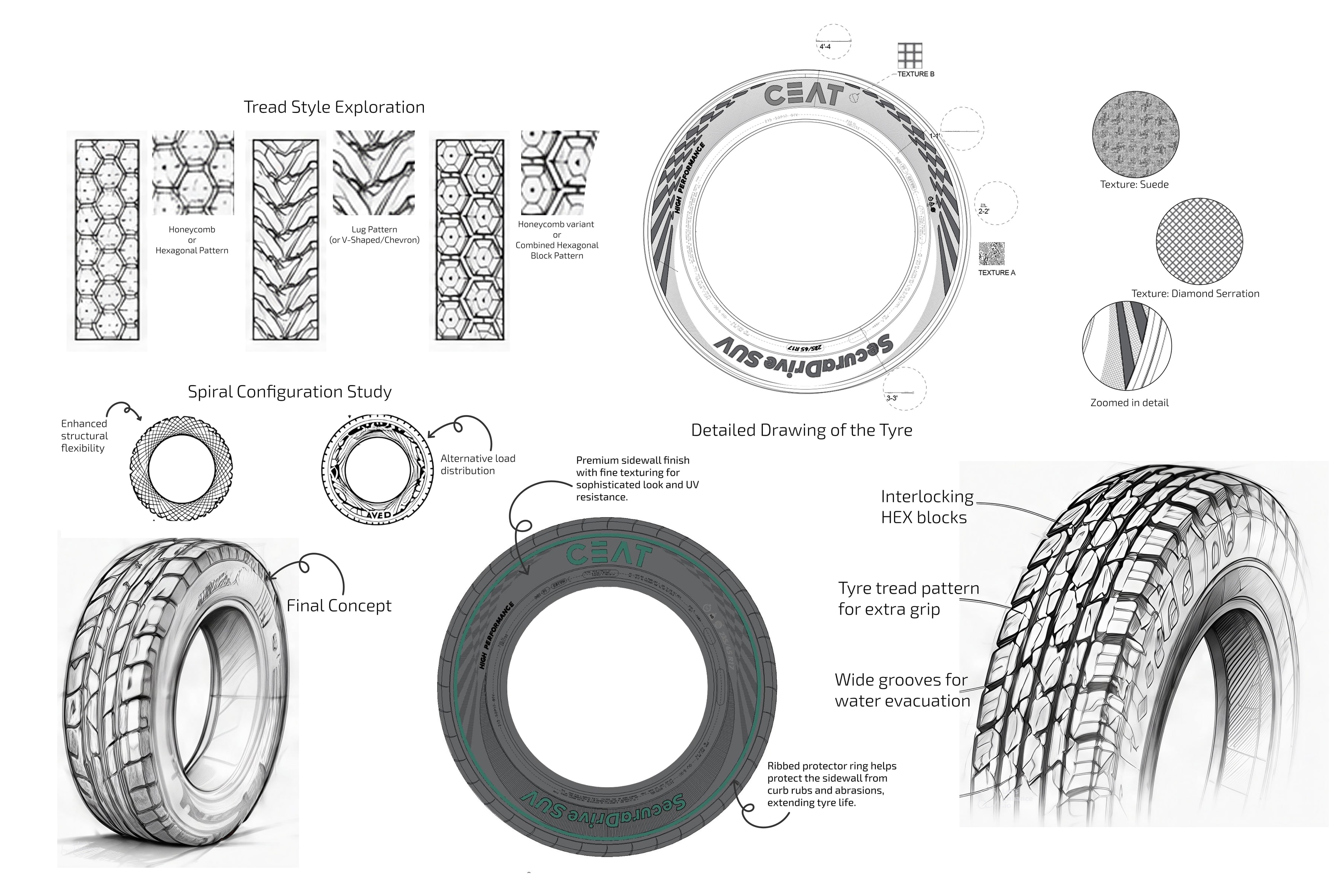
The research then moved into the material itself. Working with tyre engineers and mould-casting specialists, rubber was explored as a communicative surface. Serrations, directional ribs, textures and typography were developed and tested to understand how form, light, touch and scale could express different product characteristics.
Sketch Development
The explorations tested how these elements could work together, from the proportion and depth of typography to the density, direction and texture of the rubber. Ideas were refined through the constraints of the mould and the performance requirements of the tyre.
The final system had to withstand manufacturing tolerances, abrasion, UV exposure, weather and long-term use without losing its clarity.
Final Outcome
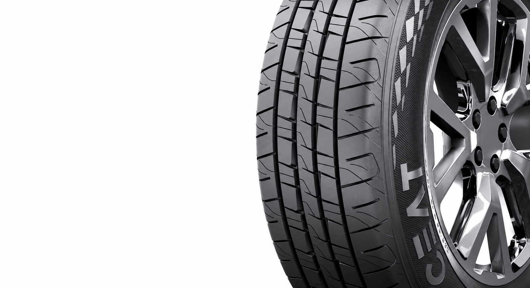
The final sidewall brings regulatory information, brand identity, product differentiation and tactile expression into one coherent system. Fine texturing creates a refined finish and supports UV resistance, while the ribbed protector ring helps address kerb rub and abrasion.
The sidewall is no longer simply a surface that carries information. It becomes the face of the tyre.
More in Research
All projects